How to prepare a file for printing on ready-made cardboard boxes?
Project sizes
The design should be prepared according to the selected template available in the calculator after choosing a specific box pattern/size.
Die-cut templates are available in the D&D database and do not need to be attached to the submitted files.
Do not change the proportions, dimensions, or layout of the provided template.
Preparing the artwork
The finished design should be prepared as a multi-page PDF file (for single- or double-sided print designs).
All essential design elements, such as texts, logos, and important graphic elements, should be placed only within the designated safe area, maintaining a distance from the crease lines and the packaging edges,
The print area depends on the box construction and is marked on the die-cut template,
Backgrounds and graphics reaching the edge should be prepared with a 2 mm bleed,
The minimum distance of essential elements from the creasing line and edges should be 5 mm.
Design template
The shape of the cutting line in the template is for reference only. There may be minor differences in the shape of flaps, locks, glue strips, and other technological elements between the template and the actual die used. The finished box dimensions, position of crease lines, and print areas remain in accordance with the product specification.
Note
Due to the nature of corrugated cardboard and the production tolerances of finished die-cuts, slight shifts of the print in relation to the crease lines and packaging edges may occur. For this reason, it is not recommended to design elements that require perfect alignment with creases, folds, or box edges.
Individual boxes in a batch may slightly differ in dimensions and die-cut layout, which is a natural feature of corrugated cardboard packaging production. This may cause minor differences in the print position between individual pieces.
Color scheme
The design should be prepared in the CMYK color space.
Do not leave elements in the RGB space, as their conversion to CMYK may cause color shifts.
The total CMYK components in the design should not exceed 200%, unless a test has previously been performed on the target material.
Excessive ink coverage may cause improper drying, ink bleeding, and loss of edge sharpness in prints or small elements. Therefore, avoid large areas of color, such as tints and solids.
If you want intense, vivid colors, build them from one or two CMYK components with the highest possible saturation. Adding a third component or black usually reduces color intensity on absorbent substrates.
For example, an intense red is best defined as:
C: 0% / M: 100% / Y: 100% / K: 0%
Black color
Black for texts, thin elements, and other black objects should be prepared only as 100% K, without additional components
C: 0% / M: 0% / Y: 0% / K: 100%
Raster graphics and photos
Raster graphics, photos, and bitmaps should have a resolution of at least 300 dpi.
Enlarging graphics with too low a resolution does not improve their quality and may result in visible pixelation or loss of sharpness in print.
Texts and vector elements
Logos, texts, QR codes, and barcodes are best prepared as vector elements.
All texts should be converted to outlines.
QR codes and barcodes
Codes should be black 100% K on a light background. QR requires a blank margin, the so-called quiet zone, of at least 4 modules on each side.
Color reproduction and substrate influence
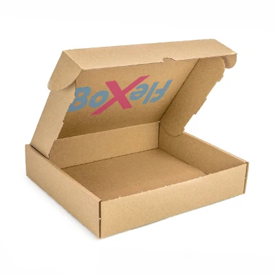
Printing is done without the use of white ink. This is especially important for grey (brown) cartons, as the substrate color affects the final appearance of the print. The monitor emits light, while the cardboard reflects it. Therefore, even a correctly prepared design may look slightly different on screen than on the finished bag.
For projects where color is crucial, the best way to assess the effect is to order a prototype for 1 PLN. https://www.printnet.pl/pudelka-tekturowe-gotowe-lista