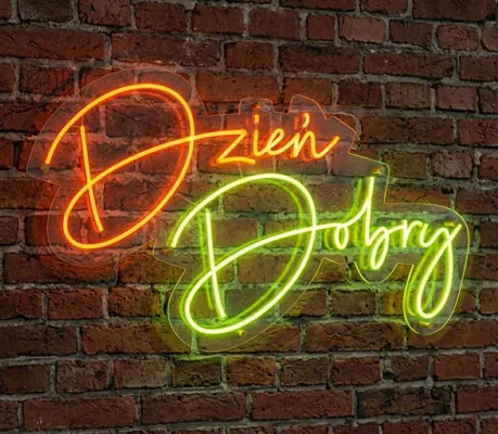
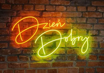
Neon Led is an impressive form of signage and decorative illumination, combining precise CNC machining with LED technology. The system involves milling a groove in the base plate, installing a flexible LED strip, and embedding a colored silicone light-diffusing cover. The color of the LED strip's light is identical to the color of the cover. This allows for illuminated inscriptions, logotypes, and custom shapes with a distinct, uniform line of illumination.
Unlike ready-made neon cables, Neon Led is made directly in the base plate according to the graphic design. This enables very precise reproduction of shapes, continuity of lines, and high aesthetic quality—especially for signs, letters, and contour forms.
This technology is ideal as an element of visual advertising, brand identification, and modern interior design—anywhere light is intended to create an effect and attract attention.
This solution is widely used in service and gastronomy venues, offices, reception areas, at events, and in exhibition projects.
Dedicated for indoor use only.
It's not that complicated—you provide the design, we turn it into a finished product.
Clean, aesthetic lighting effect that looks good in any space
Faithful reproduction of logotypes and inscriptions—without simplifications or compromises
Possibility to choose the light color
Elegant, cohesive finish with no visible technical elements
Safe and durable solution for everyday use
Wide application—from signage to decorative elements
Neon LED can serve as both the main visual element and a lighting accent highlighting the character of a brand or interior.


The products are made using Neon Frez technology, which involves milling a mounting channel in the base material, installing a flexible LED strip, and embedding a silicone light-diffusing cover.
The color of the LED strip light and the color of the silicone cover are identical.
The system is installed in grooves milled on a CNC router.
System construction
How to divide a project into neon segments for correct calculation?
In the calculator, you need to enter the number of non-intersecting neon line segments. One segment is a single, continuous line of light routed without branches and without crossing another line.
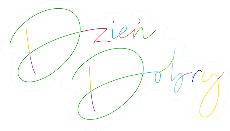
Auxiliary drawing – each color indicates one independent segment. In the sample neon “Dzień Dobry” there are 20 non-intersecting segments.
Do not sum the lengths here — length is entered in a separate field. Only the number of technologically separate neon fragments is entered here.
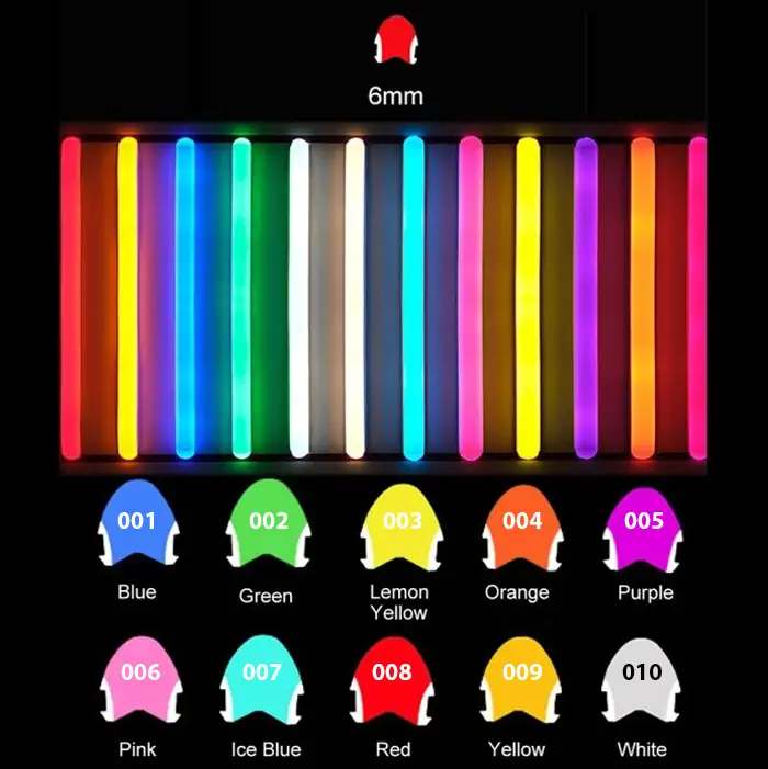
001 – blue
002 – green
003 – lemon
004 – orange
005 – violet
006 – pink
007 – l. blue
008 – red
009 – yellow
010 – white
Mounting holes
Holes are made directly in the material, allowing self-assembly using screws or bolts. (mounting elements supplied by the client)
Snapfix (snap system)
The mounting system allows quick and aesthetic fixing of elements without visible screws on the front of the graphic. The snap element is mounted on the rear side of the material.
An aesthetic mounting system that allows the element to be spaced away from the wall surface, creating a spatial effect.
Available spacers:
matte aluminum spacer 13/13
matte aluminum spacer 19/13
matte aluminum spacer 25/19
chrome-plated brass spacer gloss 13/13
chrome-plated brass spacer gloss 19/13
chrome-plated brass spacer gloss 25/19
Note!
Plexiglass with colored graphics is made exclusively from transparent sheets. The print is applied on the underside of the material using 2xCMYK + white technology, which ensures proper color saturation on the front side. The mounting groove is milled from the top side, where the Neon Flex system elements are installed — the LED strip is flush with the substrate surface.
Recommendation
Project visualization – at the design stage, it is recommended to prepare a visualization of the neon using lines with a width of 6 mm, which corresponds to the actual light line width of the Neon LED. This allows you to properly assess the proportions of the project and present the final effect.
Preferred format: CDR (V17)
Accepted formats: PDF
Not every font is suitable for LED Frez lettering. The typeface must allow the light line to be routed along smooth arcs, so we recommend avoiding sharp angles and do not allow very tight details.
Proper font preparation
For non-script (block) fonts with a defined character thickness (e.g. Arial, Montserrat, etc.), additional preparation of the neon routing line is required. Two solutions are acceptable:
for larger letters, the neon can be routed along the outline of the character; the minimum distance between parallel neon lines should be 15 mm,

for small elements or thin characters, a single, centered neon routing line should be used (the central line of the character).

Note!
The choice of neon routing method depends on the size of the letters and the technological feasibility of production.
For fonts with a complex structure, we can propose a correction or replacement with a technologically feasible typeface.
Due to the production technology of neons, the aesthetic quality of the project largely depends on the correctness of vector path preparation. At joints with a small angle, elongated material cutouts are formed, which may reduce the visual smoothness and aesthetics of the finished element—especially in projects with a large number of sharp bends.
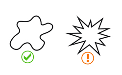
This does not mean that they cannot be made, but to achieve the best visual effect, you should:
Projects with simplified, smooth shapes allow for the production of elements from fewer sections, resulting in higher aesthetics and a more uniform neon light line.
Technological note
Due to the construction of Neon LEDs and the way the tape is routed, in some places—at bends, sharp arcs, or certain joints of Neon LED sections—minimal visibility of light points at an angle may occur. This phenomenon is not visible when viewing the neon from the front and does not affect the final visual effect of the lettering.
If the neon is made on a substrate of any shape, the outline of the substrate should be prepared as a separate page in the file.
Color: 100% K
All necessary information can be found in the Help for Large Format Printing (Arizona)
LED neon can be mounted on various types of carrier boards. The choice of substrate affects the visual effect and the method of displaying the installation.
Clear acrylic board with a thickness of 6 mm. Allows for a “floating” line of light effect with a minimally visible structural background. Used in applications where the substrate should remain visually neutral.
Satin (matte) acrylic board with a thickness of 6 mm. Reduces reflections and surface glare. Provides a more diffused, calm background for the lighting installation.
Black acrylic board with increased thickness of 8 mm. Creates a strong contrast for the illuminated line. Used in projects requiring a sharp separation of light from the background and greater rigidity of the carrier.


Acrylic substrate with applied color graphics. Enables the combination of a lighting element with a visual layer – print (e.g. background, shape, graphic sign, graphics). The design is prepared individually.